Choosing exterior paint colors isn’t just about curb appeal, it’s a project that affects resale value, maintenance schedules, and how well your home weathers the elements. The right color scheme can make architectural details pop, disguise problem areas, and even keep your HVAC costs down by reflecting summer heat. But with hundreds of paint chips at the home center and constantly shifting trends, where do you actually start? This guide walks through the practical side of selecting exterior house paint colors, from understanding undertones and light conditions to coordinating trim and testing samples the right way.
Table of Contents
ToggleKey Takeaways
- Exterior paint colors directly impact resale value, with neutral tones like charcoal gray and slate commanding premiums of around $3,400 while affecting home maintenance and HVAC efficiency.
- Undertones and light direction are critical—north-facing walls appear cooler and more muted while south-facing walls intensify color, requiring paint samples to be tested on all four elevations throughout the day.
- Trending exterior paint colors for 2026 lean toward warm neutrals like greige, earthy greens (sage and olive), and deep charcoals paired with white trim, replacing the cool grays that dominated the 2010s.
- Test paint colors using large 2’×2′ sample boards left on your home for at least three days before committing, as small chips cannot represent how colors appear across 2,000 square feet of siding.
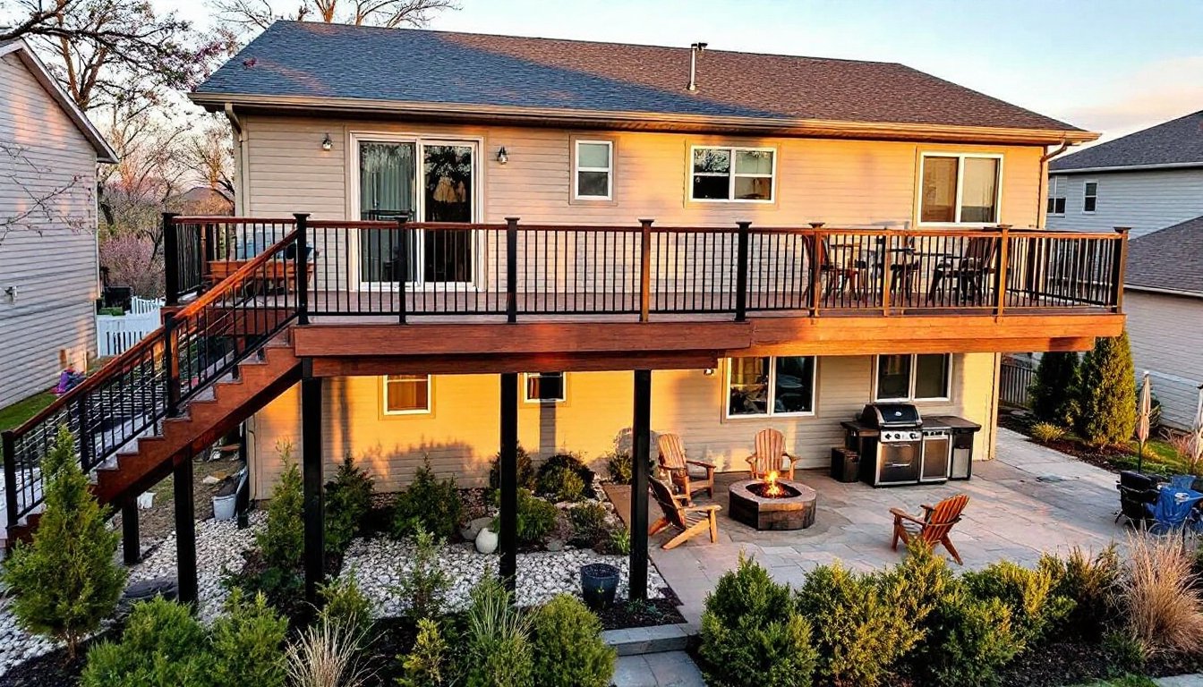
- Limit your exterior house paint color scheme to three colors maximum—body, trim, and one accent—to avoid a busy design, with white trim being the safest choice for nearly any body color.
- Dark colors on vinyl siding void manufacturer warranties and cause premature paint failure due to heat absorption, while lighter colors reflect UV radiation and extend paint life despite showing dirt faster.
Why Exterior Paint Color Matters More Than You Think
Paint isn’t cosmetic window dressing, it’s the first line of defense against UV degradation, moisture intrusion, and temperature swings. Quality exterior paint acts as a sacrificial barrier, with pigments and binders formulated to expand and contract with siding without cracking.
Darker colors absorb more heat, which can cause premature paint failure on vinyl siding (most manufacturers void warranties if you paint vinyl darker than the original color). On wood or fiber cement, deep hues can reach surface temperatures above 180°F in direct sun, accelerating chalking and fading. Lighter colors reflect more UV radiation, extending paint life and reducing cooling loads, though they show dirt faster and may require more frequent washing.
From a resale perspective, neutral house color schemes exterior appeal to the widest buyer pool. Zillow’s paint color analysis found homes with charcoal gray or slate exteriors sold for premiums averaging $3,400 above expected value, while homes with brown or terra-cotta tones lagged. That doesn’t mean you can’t use bold colors, it means understanding that personalization trades off against market appeal.
Top Trending Exterior Paint Colors for 2026
The 2026 color forecast leans toward muted, nature-inspired palettes with warmer undertones. Here’s what’s gaining traction:
Warm Neutrals: Greige (gray-beige hybrids) continues its dominance. Think Benjamin Moore’s Revere Pewter or Sherwin-Williams’ Accessible Beige, both flexible enough to read warm in morning light and cool in afternoon shade.
Earthy Greens: Sage, olive, and mossy greens are replacing the cool grays of the 2010s. These modern house paint colors exterior pair well with natural stone, cedar accents, and landscapes heavy on native plants. Sherwin-Williams’ Evergreen Fog and Behr’s In the Moment are seeing heavy use on contemporary home exteriors.
Deep Charcoals and Blacks: Matte black and charcoal siding create drama on modern farmhouse and mid-century builds. Pair with white trim for contrast or go monochromatic with black windows and charcoal trim. Avoid on south- and west-facing walls in hot climates unless using high-reflectance formulas like Sherwin-Williams’ Emerald Exterior with infrared-reflective technology.
Warm Whites and Creams: For single story trendy ranch style house exterior paint colors, soft whites with cream or yellow undertones (like Benjamin Moore’s Swiss Coffee) feel updated without straying too far from traditional ranch aesthetics.
Terracotta and Clay: Rust-tinged reds and burnt oranges work on stucco, especially in southwestern and Mediterranean climates. These warm tones complement tile roofs and desert landscaping but can clash with cool-climate brick or stone.
How to Choose the Right Exterior Paint Color for Your Home Style
Start by acknowledging what you can’t change: roofing material, brick or stone veneer, and fixed elements like chimneys or foundations. Your paint color needs to harmonize with these anchors, not fight them.
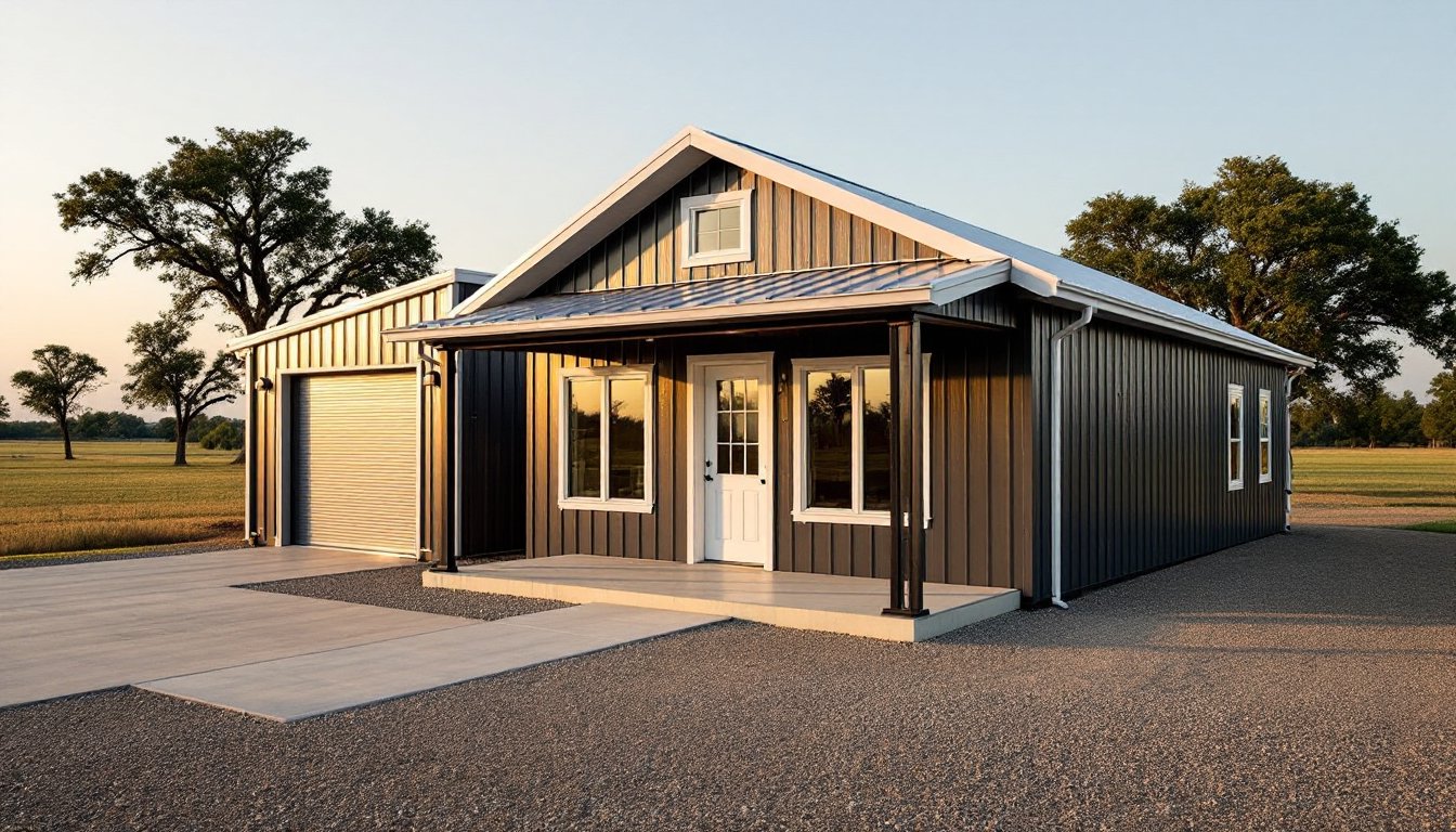
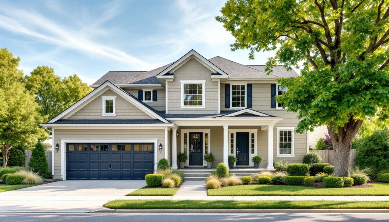
Architectural style matters. Craftsman homes traditionally use earth tones with contrasting trim, olive greens, warm browns, and deep reds with cream or tan accents. Colonial and Federal styles lean toward historical palettes: white, cream, gray-blue, or taupe with black or dark green shutters. Mid-century ranches look sharp in exterior paint color schemes that play with two-tone siding (a lighter body with darker vertical or horizontal accents). Modern farmhouses can pull off stark black-and-white combinations, while Victorian homes often showcase three or more colors highlighting decorative trim.
Consider your neighborhood context. An avant-garde purple might look stunning in isolation but can hurt resale if every other home on the block is gray or beige. HOA covenants may also restrict exterior color schemes, always check before purchasing paint.
Understanding Undertones and Light Conditions
Undertones, the subtle color biases beneath the surface, determine whether a gray reads warm or cold, whether a beige looks pink or yellow. Paint chips lie: colors shift dramatically between the 200-lux lighting of a paint store and full daylight.
Directional light exposure changes everything. North-facing walls receive cooler, indirect light all day, making colors appear more muted and blue-gray. South-facing walls get intense, warm light that can wash out pale colors and intensify darks. East-facing walls catch golden morning sun, while west-facing walls endure harsh afternoon glare and heat.
Test paint samples on all four elevations. A warm greige that looks perfect on the shaded north side may turn sickly yellow on the sun-blasted west wall. Time of day also matters, view samples in early morning, midday, and late afternoon to catch the full range of light conditions.
Undertones in best exterior paint colors also need to match your fixed elements. If your brick has pink undertones, avoid greens or grays with green undertones (they’ll clash). If your stone is cool gray, skip warm yellows and taupes. Hold paint chips directly against brick, stone, and roofing samples to check compatibility before committing.
Common Mistakes to Avoid When Selecting Exterior Paint Colors
Choosing colors in the wrong light: Paint stores use artificial lighting that doesn’t replicate daylight. Always take chips outside and view them against your home’s siding.
Ignoring sheen: Flat or matte finishes hide surface imperfections but don’t scrub clean as easily as satin or semi-gloss. Use satin or low-luster on siding, semi-gloss on trim, and high-gloss on doors for durability and washability. Sheen also affects color perception, higher sheens reflect more light and can make colors appear lighter.
Skipping the primer: If you’re making a dramatic color shift (dark to light or vice versa), tinted primer is non-negotiable. It improves hide, reduces the number of topcoats needed, and prevents tannin bleed-through on wood siding. On bare wood, use an oil-based or shellac-based stain-blocking primer.
Not accounting for scale: A 2-inch paint chip looks nothing like 2,000 square feet of siding. Colors appear more intense at scale, what looks like a soft sage on a chip can read as electric lime across a whole façade. That’s why testing large samples is critical.
Forgetting about fading: All exterior paint colors for homes fade over time, but reds, yellows, and dark blues fade fastest. If you choose a bold hue, expect to repaint every 5–7 years instead of 10–12. Lighter neutrals and earth tones hold up longer before showing noticeable color shift.
Matching trends too closely: What’s trendy today looks dated in a decade. If you’re not planning to repaint soon, lean toward classic best paint colors for exterior of house that have staying power, whites, grays, taupes, and muted greens won’t scream “2026” ten years from now.
Testing Paint Colors Before You Commit
Never buy five-gallon buckets based on a paint chip. Here’s how to test properly:
Get sample pots: Most paint manufacturers sell 8 oz. sample sizes for $5–10. Buy samples for your body color, trim, and accents.
Paint large test boards: Cut 2′ x 2′ sheets of smooth plywood or hardboard (you can reuse scrap siding if you have it). Prime the boards if needed, then apply two coats of your sample color. This simulates actual coverage and finish.
Mount samples on all four walls: Tape or prop the boards against your home’s siding on north, south, east, and west elevations. Leave them up for at least three days so you can observe how the color shifts throughout the day and in different weather (cloudy vs. sunny).
View from the street: Step back 50 feet and look at the samples from curb level, that’s where most people will see your home. Colors that look great up close can disappear or clash at a distance.
Check against fixed elements: Hold samples next to brick, stone, roofing shingles, gutters, and windows. Make sure the undertones play nicely.
Involve the household: If multiple people live in the home, get buy-in before committing. Paint is cheaper to change than siding, but repainting an entire house is still a $3,000–$8,000 project on a typical single-story ranch.
If you’re still unsure, many professional painters and color consultants offer on-site consultations for $100–$300. They can identify undertones, suggest complementary exterior paint color ideas, and help narrow down choices based on your home’s style and surroundings.
Coordinating Trim, Accents, and Front Door Colors
The body color is only part of the equation. House color schemes depend on how trim, shutters, and doors interact with the main siding.
Trim color: Most homes use a contrasting trim color to define windows, doors, and cornerboards. White trim is the safest bet, it works with nearly any body color and adds crisp definition. For a subtler look, choose trim that’s 2–3 shades lighter or darker than the body. On modern homes with minimal trim, consider going monochromatic (same color for body and trim, different sheens).
Window frames and sashes: If you have wood windows, paint them the trim color. Vinyl and aluminum windows come in limited colors (white, tan, bronze, black). If your windows are white and you’re painting trim a different color, either replace the windows (expensive), wrap them in aluminum coil stock painted to match (moderate cost), or choose a trim color that coordinates with white.
Shutters: Functional or decorative, shutters should be darker than the body color. Classic pairings: black shutters on white, gray, or beige homes: dark green shutters on cream or tan: navy shutters on light gray. Avoid matching shutters to the body color, they’ll disappear visually.
Front door: This is your accent opportunity. A bold front door color adds personality without committing the whole house. Popular choices trending on home design sites include deep navy, charcoal, forest green, and even burgundy or terracotta. Make sure the door color complements both the body and trim. If your body color is cool-toned, choose a cool door color: if warm, go warm.
Garage doors: Large garage doors can dominate the façade. Painting them the same color as the siding helps them recede. For a more intentional look, paint them the trim color or an intermediate shade between body and trim. Avoid bold accent colors on garage doors, they’re too large to pull it off.
Accents and details: Porch ceilings traditionally get painted haint blue (a pale blue-green) in southern regions, but any light color works. Railings usually match trim. Gutters and downspouts should blend with trim or siding, not contrast (unless you’re going for an industrial look with black gutters on a white house).
For houses paint colors exterior coordination, stick to a maximum of three colors: body, trim, and one accent (door or shutters). More than that and the design starts to look busy. If you have a stone or brick façade covering part of the home, count that as one of your colors.